Comparing and Contrasting Podcast Apps
![]()
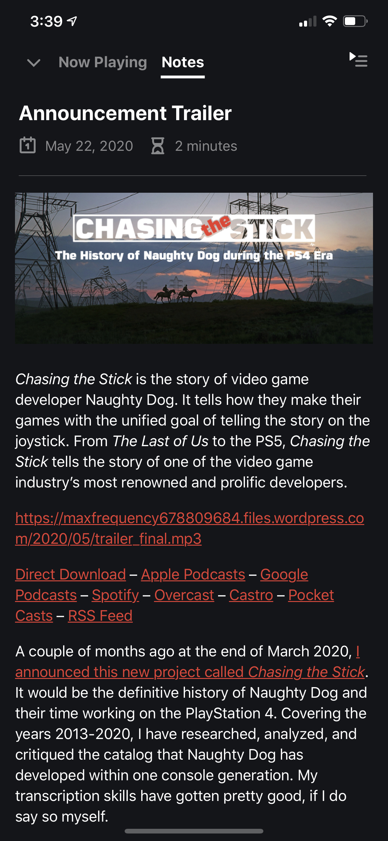
As I prepared to publish Chasing the Stick, one factor I dug into was audio distribution for the audiobook version. Since I wanted to release everything for free and wanted it to be accessible, I chose the route of releasing it as a podcast. Free, open format with ease of access and plenty of choice for the end user.
Due to this wide variety of access, I wanted to make sure that Chasing the Stick appeared on multiple podcast apps / platforms. So I downloaded six podcasting apps that I felt covered the bases. Three are exclusively iOS apps and three are multiplatform: I chose Overcast, Apple Podcasts, Castro, Pocket Casts, Spotify, and Google Podcasts.
While the primary focus of distributing the audiobook version is allowing listeners to actually listen, I noticed a wide range of differences in how each app presented the episode’s show notes and description. This made me want to take a look at these differences and compare these apps.
Overcast
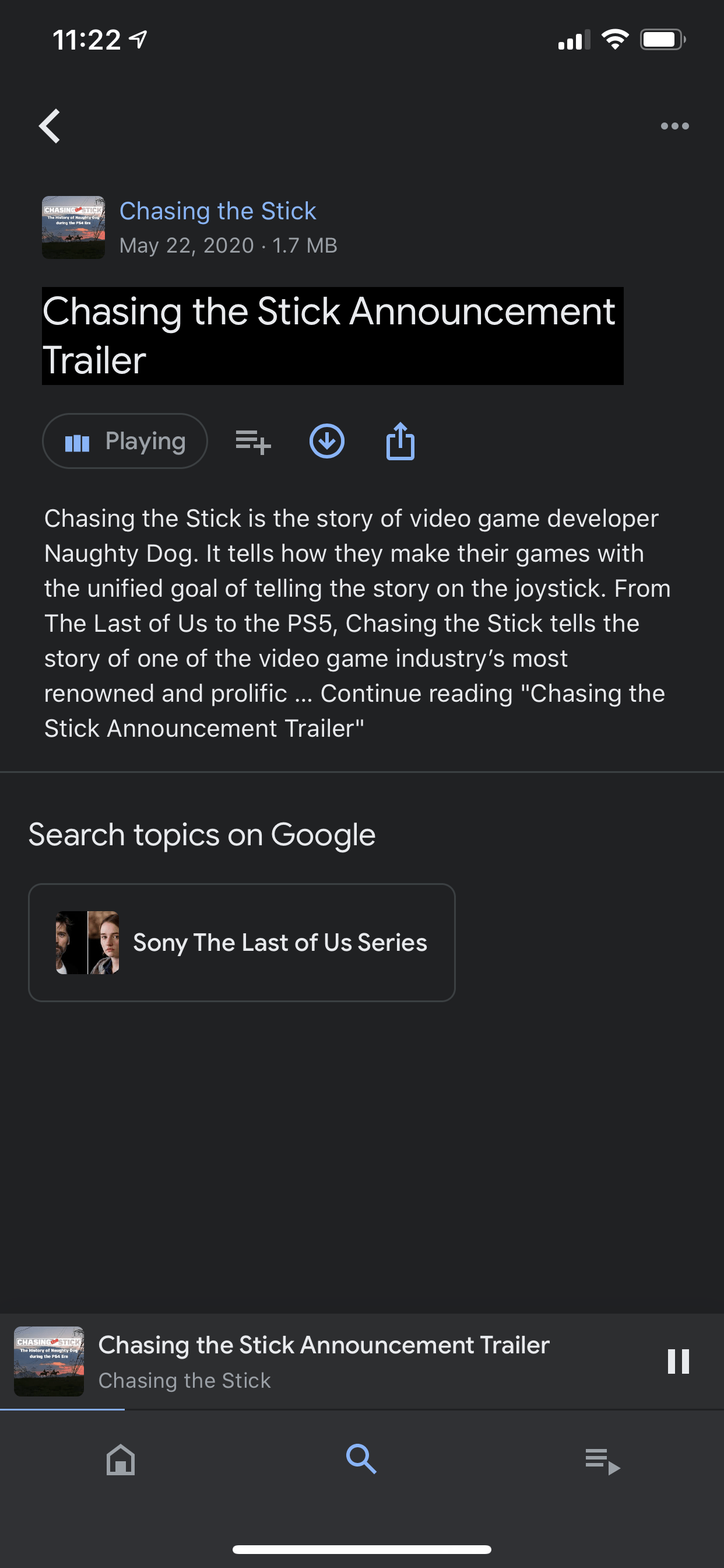
First and foremost, I personally use Overcast. I am also a Premium subscriber for an ad free interface, some other cosmetic options, and the ability to upload personal files. You do not need to be a subscriber to have the same user experience though.
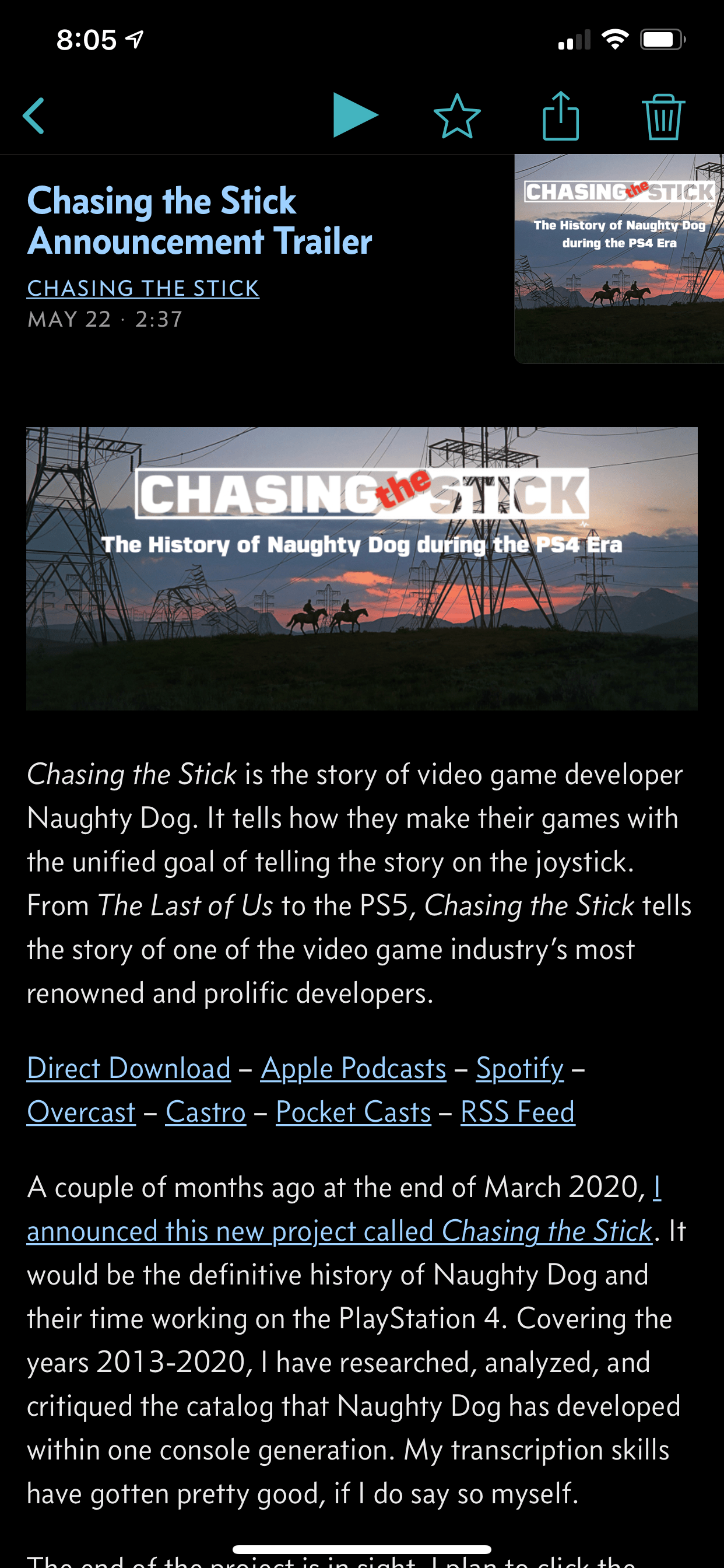
The top of the episode information page contains the details of the episode including the name of both the show and episode, the episode length, podcast art, and the release date. Beneath that is the content of the post in the RSS feed properly displayed. No formatting snafus. It is the same as what you’d see on my site.
The play controls being at the top keep the content clear. The whole page is readable and intuitive. It just works. The app does not get in the way of the podcast.
Apple Podcast
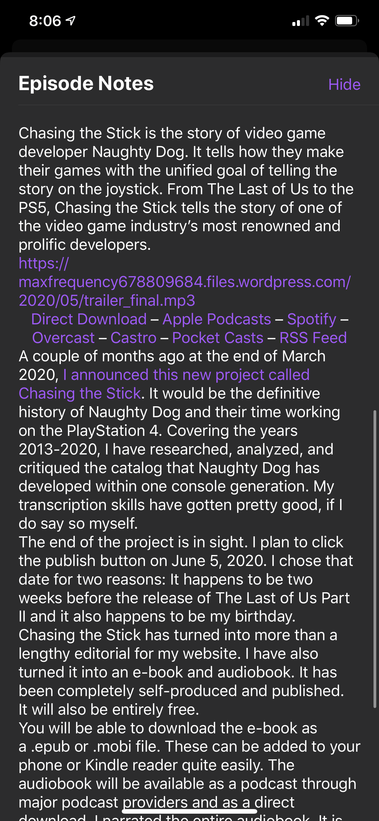
So Apple appears to just be taking the text and slapping it in a “Episode Notes” field. You have to swipe up from the bottom of the episode page itself to find these notes. It’s essentially hidden from the listener. Sure makes my work look pretty rough, especially after trying to make it look great on my site.
Thankfully the app doesn’t block the podcast itself though. It just puts a pane of smudgy glass in between the user and the content.
Spotify
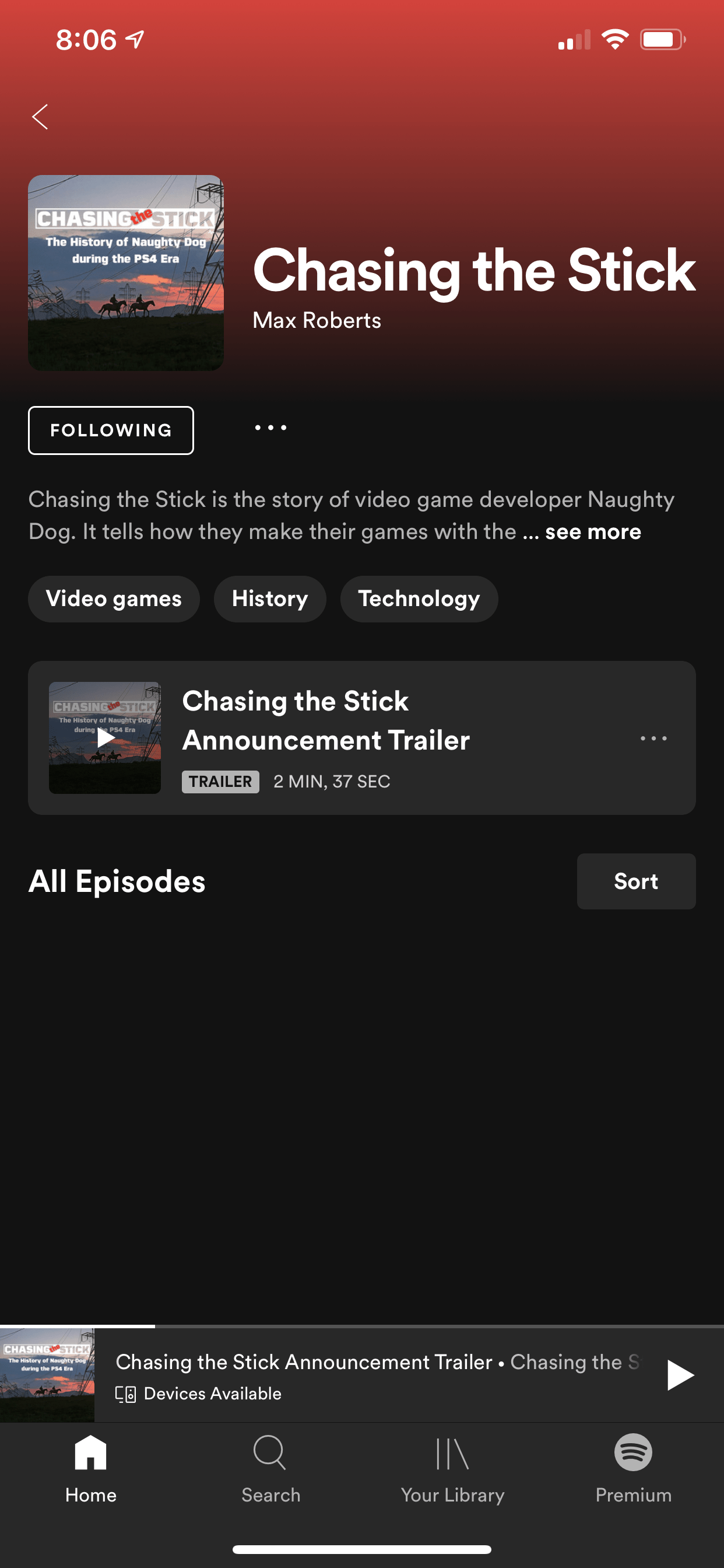
Spotify is doing its own thing. My episode description does not exist. Maybe this is because I marked the episode as the podcast’s trailer? Who knows? At least the page looks decent.
Castro
Welcome to rounded corner design! What is going on down on the bottom of the app? There are three different sized series of buttons all segmented. Granted, the bottom is for the currently played podcast (I was testing with ATP). I’m not too keen on the buttons obscuring the show notes with a bit of transparency. Although, it does immediately go away if you begin to scroll.
In the end, Castro does accurately display the show notes, which is more than i can say for Apple and Spotify. It even recognizes the .mp3 URL scheme and removes it (just like Overcast), giving the layout a clean and clear look. Castro’s design ultimately is dependent on the user’s taste. It’s not my flavor of podcast player.
Pocket Casts
I used to be a Pocket Casts user. This is, by far, the closest experience to Overcast. Displays the episode title, publication date, and run time near the top. The description is properly formatted, but the .mp3 URL is shown. While technically an accurate display of the page’s information, it makes the information look disjointed.
Google Podcasts
Maybe it’s better on Android? I don’t know. The “continue reading” section in the description is not a button. There’s no way I could find to expand the information. Google trends appear at the bottom. The title is in some sort of black box. Not a good appearance at all.
Conclusion
This exploration has been fun for me. It’s fun to look at an app’s UI, especially when that UI is for supporting features. The number one focus of a podcast player should be playing and providing access to podcasts that the user wants to listen to. This experiment has reenforced a few things to me.
Podcasts have been, are, and should remain to be an open standard through RSS. It gives creators and users choice and control over what they want to produce and listen to. Spotify is clearing trying to circumvent that.
Good show notes are nice to have. I appreciate the podcasts I listen to that take full advantage of the medium. They are also hard to produce when the results of their presentation varying wildly among platforms.
The more support for industry standard features, the better the app can be for the user. Great design doesn’t get in the way of the listening experience. It makes it better.
Overcast is my favorite podcast player. No way you could change my mind now.