The Journey to Redesign Max Frequency
Some of you may have noticed that the site looks a smidge different lately. It’s a short answer for a longer story. There’s more beneath the hood of this redesign too. I wanted to make a proper post talking about my experience in trying to redesign the site, instead of just pretending it always looked like this.
Ignore the Wayback Machine banner. Someone forgot to properly document a “before” screenshot.
Currently, Max Frequency is hosted on WordPress. I’ve used it for nearly a decade for various projects, including my first blog Go Left Gaming. I was growing tired of WordPress this year though, due to some backend editor changes and imagining the grass was greener on the other side.
The other side of the fence was your favorite podcast ad read – Squarespace.
My plan was simple: My goals were clear. My renewal for WordPress is near the end of the year, so I planned on cashing in a sweet free trial of Squarespace to test the waters before committing. I just wanted to dip my toes in the water. I came out shivering from its frigid grasp.
All I wanted (and still want) was a straight-up traditional blog feed where the posts line up and is mostly just words. I had some aspirations like building an archive, incorporating Light/Dark mode support and some fancy footnotes (I could have used a footnote here, sniff). I assumed Squarespace would have light/dark mode support and that the footnote thing wouldn’t be too tough. I was very wrong.
Squarespace is very pretty and quite focused on showcasing visual content. That includes their editor / backend. It’s full of animations and tries to be smooth as silk. In my experience, my trial site was nearly uneditable my entire time. The edit buttons would not work or load content. I tried Safari, Chrome, and Firefox. I cleared caches, cookies, and tried a private browsing window. All of it turned up a busted system that wouldn’t let me edit the blog feed or my site.
I did manage to import all of Max Frequency’s posts there, but the styling came in totally borked. As far as I could tell, I’d have to manually edit my 400+ posts to get them to look the way I wanted or try to reimport them.
I worked with their support for a few days, but they wanted me to sign-up for third-party screen recording software and could not replicate my issues on their end. Ultimately, I just gave up and tried to execute my vision on WordPress.
The catch with WordPress is that to get the Light/Dark mode and footnote support, I’d either have to host the site myself and use WordPress.ORG or sign up for the $300 business tier to use plug-ins. That’s just not feasible for me given my lack of programming knowledge and the fact Max Frequency generates zero income.
Turns out though, I could make my biggest goal a reality.
I finally set-up a proper search page and archive at maxfrequency.net/search. The previous search function on the site was a sidebar plug-in but it always looked wonky, especially on mobile. I removed that from the right-hand margin and centered the blog. I then made a dedicated page for searching the site to give it all a cleaner look.
I then remembered that WordPress’ URL scheme would probably let me just separate posts out by month. It did! So I made a linked archive inspired by Hypercritical by John Siracusa.
“But Max, this archive goes back to 2013. You started Max Frequency last year.”
Quite the observation loyal reader. I took that strategy of importing Max Frequency to Squarespace and applied it to Go Left Gaming. Now, all my writing online is in one place. From my Guacamelee! review on May 18, 2013 to the latest episode of Chapter Select, it’s all here, dated properly, and searchable. I also saved what reviews and editorials I could from now-defunct sites like PS Insider and PlayStation Wire, dated those properly and added them to the site with links to their archive on the Wayback Machine (if it existed).
For my work that exists on DualShockers, I took a cue from Jason Snell of Six Colors. Jason writes for Macworld every week. He links to it on Six Colors with an excerpt to entice folks to read the whole thing on Macworld. I took the same approach to my reviews and editorials on DualShockers. This let’s DualShockers keep the click and article, while I get to have a proper online archive of my writing. I wish I could make post titles active links to the external posts themselves, but that’s outside of my tier of WordPress, unfortunately.
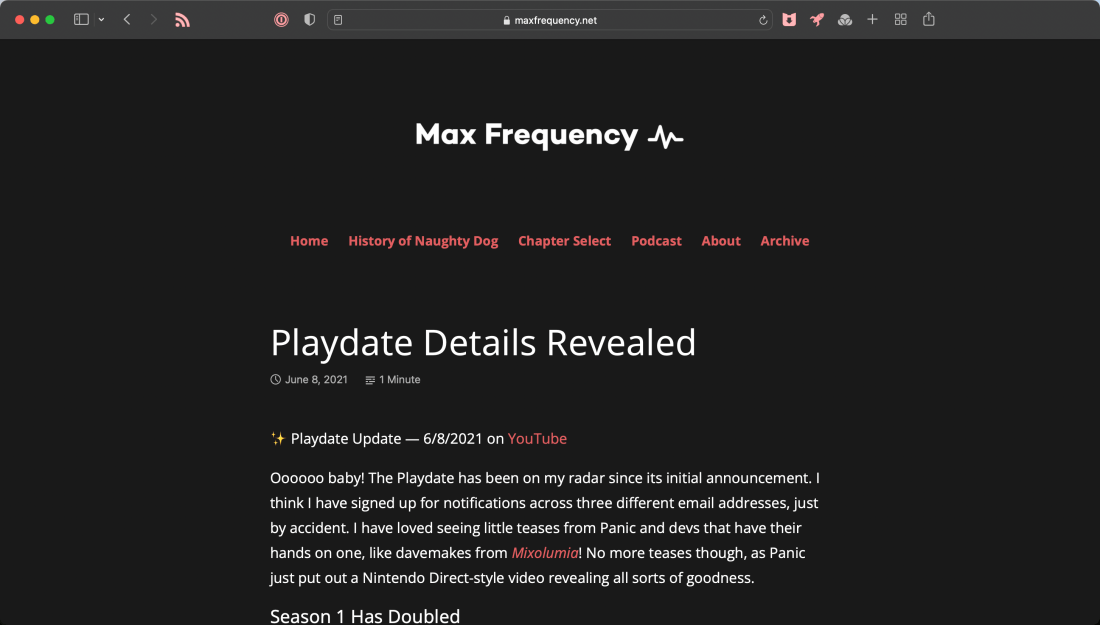
As for the visual design, I wanted to center everything up and keep my dark gray background. While trying out Squarespace, I did land on using a shade of red for links instead of the standard blue. I just took the red accent color from macOS. I wish it didn’t change the menu links at the top of the page, but I can live with that.
In the end, I’ve come out much happier with the form and function of Max Frequency. I seriously love having all my writing in one place now. I can finally shutdown Go Left Gaming without losing one sentence. There are still elements I’d love to add some day, but for now, I’m happy with the look for Year Three and beyond. Plus, it’ll help user in some new ideas and projects I have. I always have new ideas .