Upgrading My Switch Collection
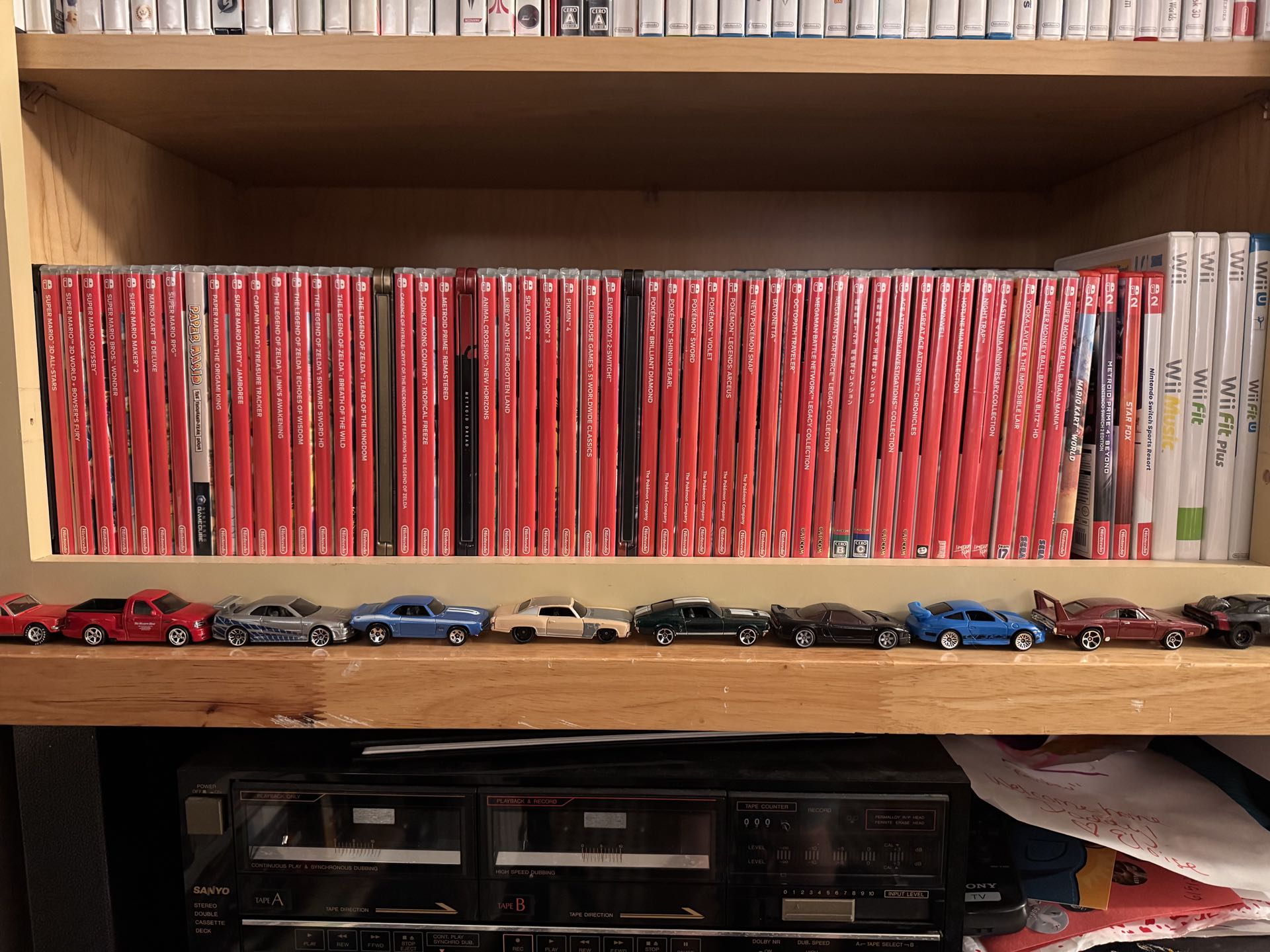
Pay no mind to the pile of cards and drawings from my daughter underneath. Look at all that bland, uniform white text against the sea of Nintendo Switch red, only broken up by a few Steelbook cases. I can only think of one other spine treatment more horrifying than this soulless display.
Six years ago when I got a Super NT for the first time, I set out on a little project to protect my entirely loose SNES cart collection. I bought these BitBoxes and printed art for them. Seeing them in nice boxes with art made my heart quite happy. While my Switch collection is complete-in-box, I got tired of the same bland spines with the only knowledge of what game was where being in my head.
I had heard of custom Switch Spines before (along with custom booklet manuals), but never looked beyond an Etsy page. The cost was always a deterrent. For my collection, it'd be upwards of $60 for spines. Then one day this week, it just hit me that I could do it myself.
So I did. For three bucks.
Of course there is an entire subreddit for Switch Spines, but given the nature of reddit, it is not a very searchable format. Thankfully, someone made The Spine Archive with compiles all the spines into a searchable database and easy tool. Pick the spines you want and it adds them to a PDF that you can download. Just watch out for the height of the "Nintendo Switch" bit at the top if you want them to all be uniform; some creators shorten that element up or remove it.
Also, double check you have all your games selected. I forgot Super Mario RPG and Bayonetta in my first run. So I printed a second with Switch 2 games and ended up forgetting Star Fox.
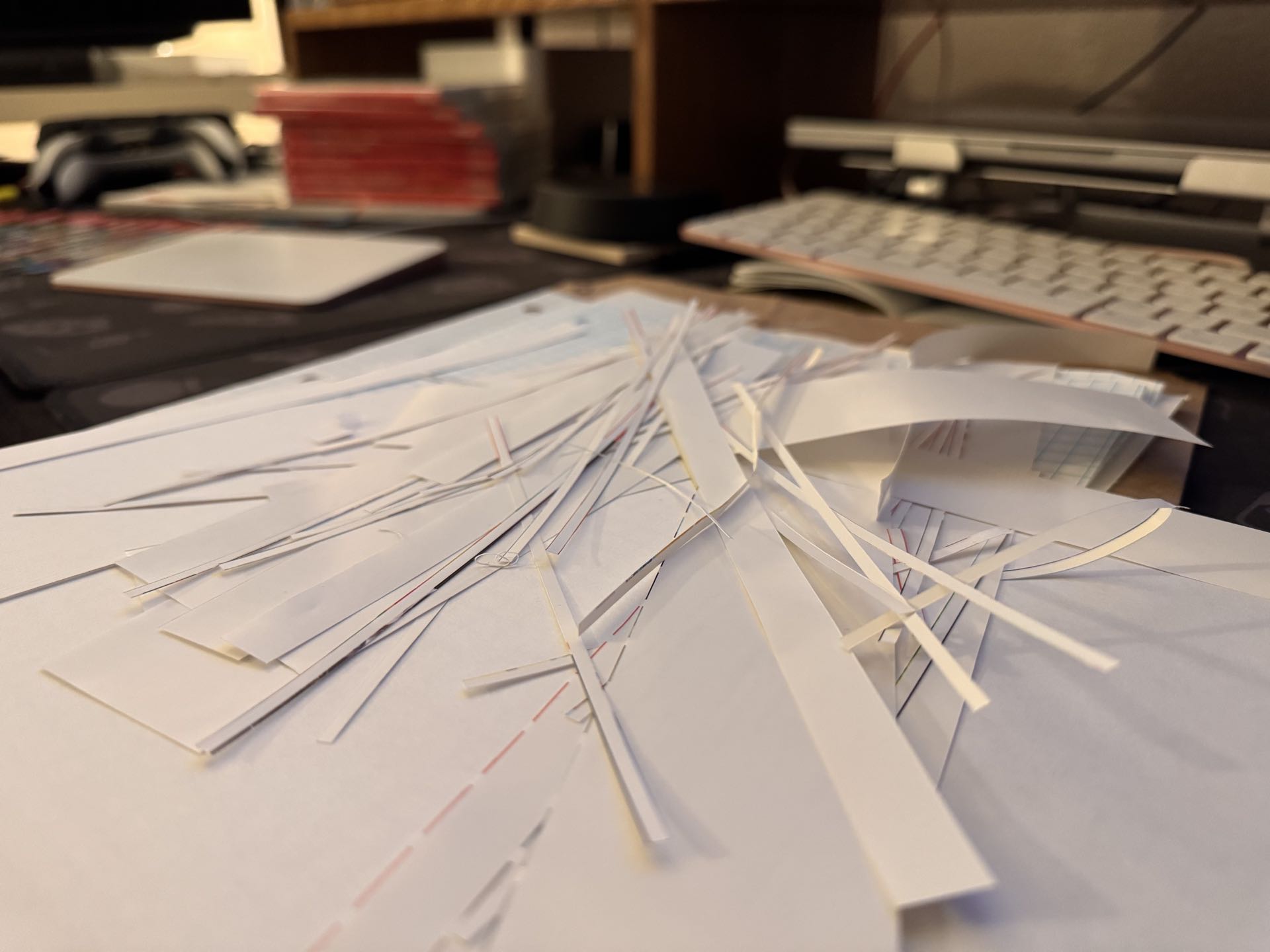
Now, I have a nice printer, but I wanted a glossy paper finish, so I sent it off to FedEx for printing. Three bucks and an hour later, I had beautiful, glossy prints. As for cutting them, I borrowed my dad's X-acto knife and a ruler. It was tedious, but a cup of coffee and a few music albums later, the task was complete.
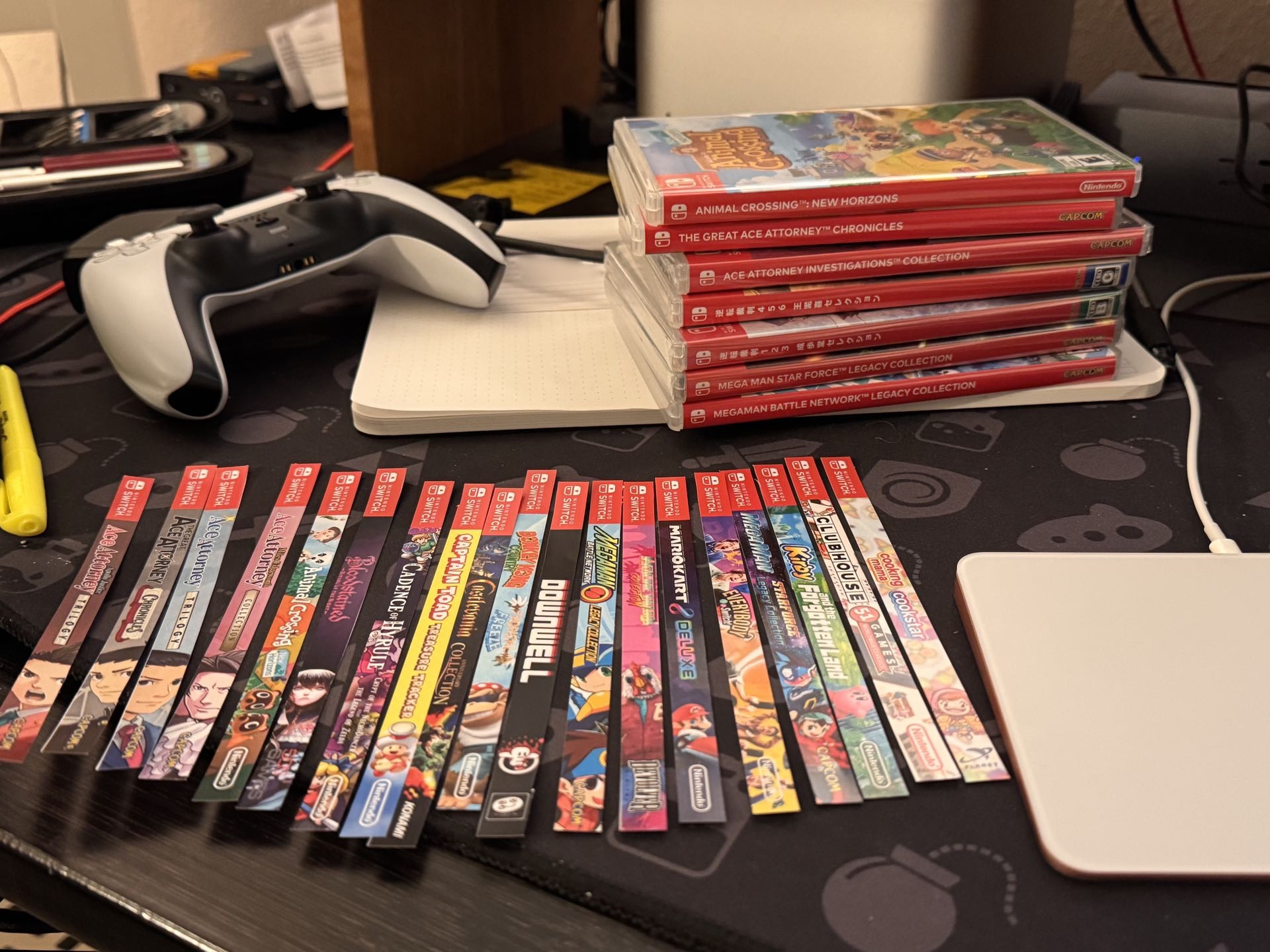
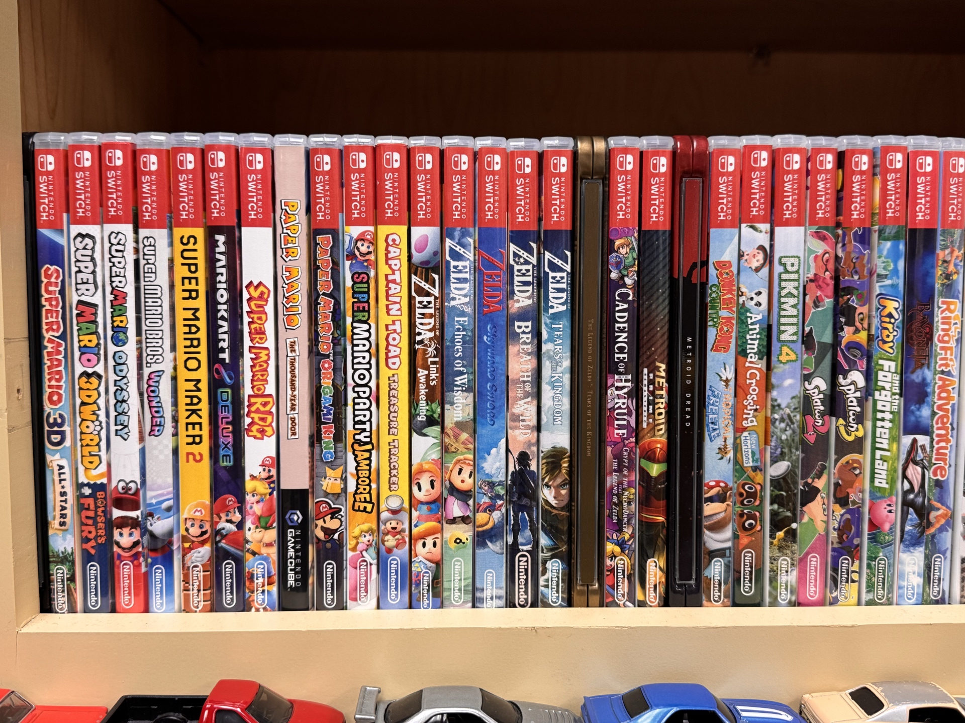
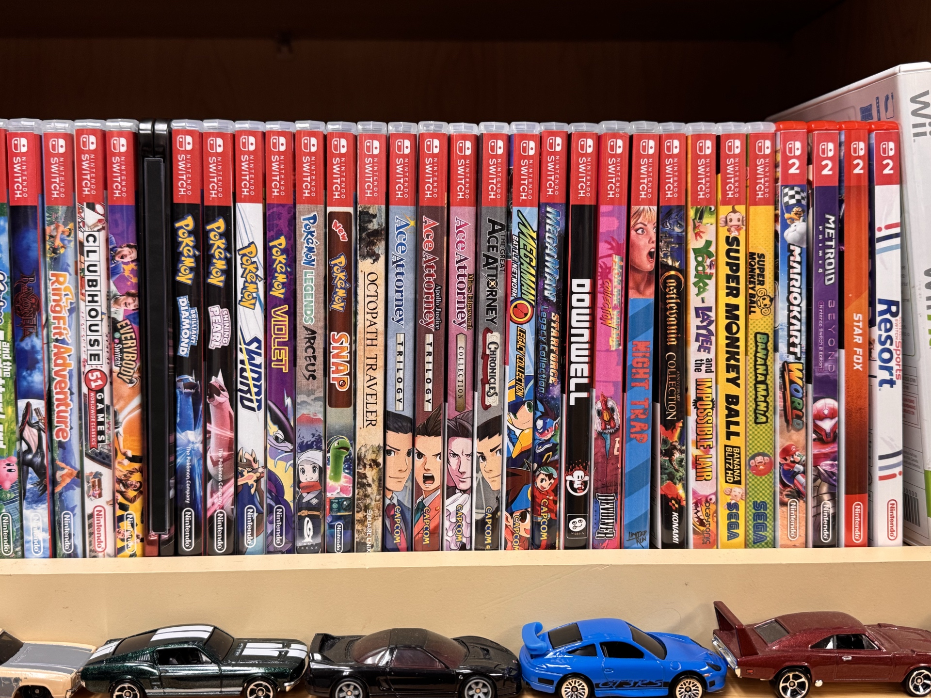
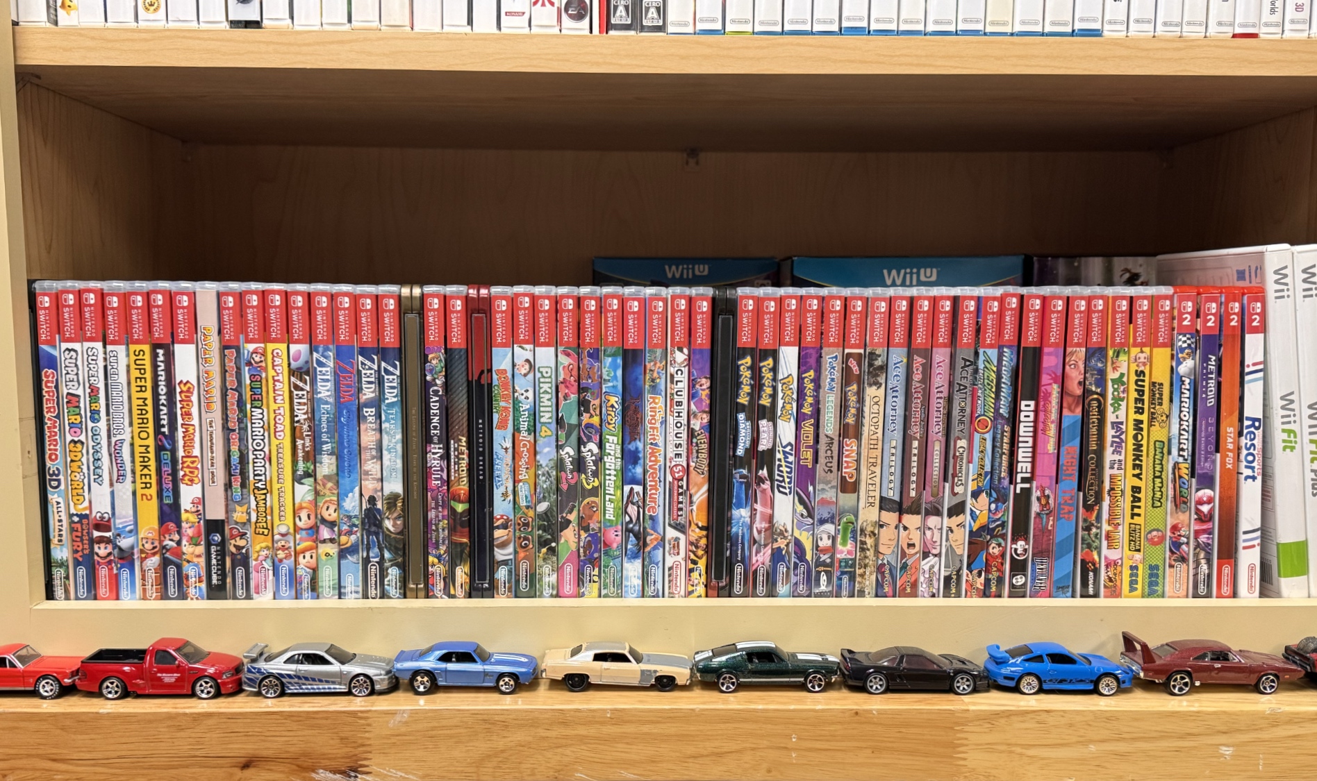
I think these all look infinitely better. The games art shines and the shelf is way more readable, despite the cacophony of colors and branding. I think this is a testament that simple and clean is not always the best for users. A game's key art is the first thing you see of a title on store shelves. Back in the day, it was the only way to even imagine what the game was or promised. Sometimes those promises were lies, but others were spot on. As my kid grows up and she explores video games, I hope these spines draw her eye more than white text on a red background. As physical games wither in the marketplace, this project was an infusion of life my collector spirit needed.